Building beautiful buttons in Canvas Apps part 2 - dark neumorphic buttons with glowing icons!🔮
By popular demand, I’m back with part 2! Firstly, thank you to everyone for all your amazing comments and feedback on part 1 - it motivates me to continue doing what I’m doing and sharing it! 😊🙌
In today’s blog post, we will build the dark version of neumorphic buttons. If you missed the first post, and would like to find out more about neumorphism and this series - make sure you check out the previous post! If you haven’t read the previous post, please don’t worry - I’m going to explain the logic step by step here just like I did with the previous post.
Before we start with the post, there’s a very important disclaimer - this is a very low contrast theme. Please do not blur out the shadows around the button any further as this will make it incredibly difficult for anyone with visual impairments to recognise it as a control. I have made the shadows distinctive and close to the ‘surface’ so that they are visible to users with colour-blindness filters and also greyscale (including inverted).
Firstly, let’s set the background fill of our app to that colour. We will be working with this shade - #515151/RGBA(81,81,81,1).
Our buttons will consist of three controls:
Button control - we will layer this on top of our HTML and image.
HTML control - this will contain the <div> with the box shadows and other styling,
Image control - this will contain the SVG code.
Let’s start with a button. Our button will be transparent and layered over the image and the HTML control. To create the transition of the box-shadow to inset (make the button like it’s been pressed), we will be using a contextual variable. It will also be responsible for the colour of our SVG.
Please update the following properties:
Tooltip - specify what this button will do when pressed to make it accessible to screen readers and also clarify to users what your button will be responsible for,
Fill - set this to Transparent,
Text - remove ‘Button’ text and leave this blank,
HoverFill - this will be our favourite colour that you might recognise from my previous post - RGBA(196,196,196,0.2)
PressedFill - this will also be the same colour, just with less transparency - RGBA(196,196,196,0.5)
BorderRadius - we want the corners to be round-ish so please set this to 25px,
Height and Width - please set both to 100px,
OnSelect - this is where our contextual variable will be located. To set a contextual variable (that will work on this screen only) we will use the UpdateContext() function. If a button is pressed, we want it to appear ‘pressed’. If it’s clicked on again, it should return to its original state. Our formula will look like this - UpdateContext({pressedbutton: !pressedbutton})
As with the previous post, as our button is transparent - you will not be able to see anything yet!
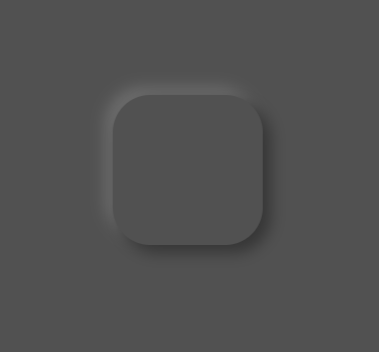
If you’ve read my previous posts, you’ll know that I love the HTML control. To build the foundation of our button, we are using the HTML control. HTML controls are a fantastic way to inject additional styling using inline CSS that you would not otherwise be able to achieve natively in Power Apps. Our baseline control will look like the below. A bit of box shadow, a bit of border radius, and it’s ready!
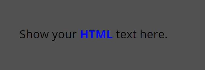
To start with, we need to add the HTML control to our canvas (it works seamlessly in both the full version of Power Apps maker studio as well as the Teams version). You will then be greeted with some default text. As it is a HTML control, the text itself has some inline formatting applied to it.
<"Show your <b><font color=blue>HTML</font></b> text here."
We are now ready to add a ‘box’ to our screen, or more precisely - a <div>. This is where our code will reside and what will drive the design of our button. In one of my previous posts, I’ve detailed how to use the HTML control if you’d like to check it out!
"<div style=' <— opening tag —>
margin: 30px; <— as we are using box shadow with some blur, we need to change the margin to ensure that the box shadow doesn’t get cut off with a straight line —>
width: 100px; <— width of our control —>
height: 100px; <— height of our control —>
box-shadow: 5px 5px 10px #353535,
-5px -5px 10px #6d6d6d; <— our box-shadow —->
border-radius:25px' > <— let’s give our control some rounded corner —>
</div>" <— closing tag —>
The snippet should look like this:
"<div style='
margin:30px;
width:100px;
height:100px;
box-shadow: 5px 5px 10px #353535, -5px -5px 10px #6d6d6d;
border-radius:25px'
 >
 </div>"
And here’s the result:
We want the box shadow to change dynamically as we press the button. To achieve this, we need to add a contextual variable and and If() statement to our code snippet. You’ll remember from my previous posts that in order to reference anything outside of the code, we need to use “&.
Here’s the structure of our snippet explained:
"<div style='
margin: 30px;
width: 100px;
height: 100px;
box-shadow: “& <— opening ‘tag’ to reference a formula in code —>
If(pressedbutton = false, <—- our if statement—>
box-shadow: 5px 5px 10px #353535,
-5px -5px 10px #6d6d6d" , <— the box shadow of our control if the button hasn’t been pressed —>
box-shadow: inset 8px 8px 16px #302f2f,
inset -8px -8px 16px #747373" ) <— the box shadow of our control if the button has been pressed—>
&" <— closing ‘tag’ —>
; <— don’t forget the semi-colon! —>
border-radius:25px' >
</div>"
Our snippet should look like this:
"<div style='
margin:30px;
width:100px;
height:100px;
"& If(pressedbutton = false,
"box-shadow:  5px 5px 10px #353535,
             -5px -5px 10px #6d6d6d",
"box-shadow: inset 8px 8px 16px   #302f2f,
          inset -8px -8px 16px #747373" )
  &"
  ;
border-radius:25px'
  >
</div>"
If you’re impatient like me, you’ll probably want to see the magic happen now… Let’s test it out! Drag the button next to your HTML control so you can see the result side by side. It should look like the below 🤩
No more watermarks on my GIF’s, I’ve paid for the subscription🤣
Don’t worry about layering the button on top of your HTML control now - we can do it at the very end!
The last part of our neumorphic button is the SVG. As with the previous post, I will show you step by step how to add an SVG, how to then dynamically change the colour and lastly - how to make it GLOW 🤩
To get the SVG, we will use the Bootstrap website I shared in my SVG blog post. Feel free to use any icon you like - I’m going to use this heart-shaped balloon because why not!
Click on Download SVG and then open it with VS Code or Notepad. I’ll use notepad just because not everyone will have VS Code on their PC’s.
You’ll remember from my SVG blog post that we will now need to replace all double quotes (“) with single quotes (‘). To do this, press CTRL + H on your keyboard (or click Edit, and then Replace) and then type “ in the first line, and ‘ in the second line, then click ‘Replace all’.
Great! To add an SVG to Power Apps, we have to use the mime type (“data:image/svg+xml;utf8,”) and then a PowerFx function EncodeUrl at the beginning of our code. Here’s the structure of the snippet:
"data:image/svg+xml;utf8, "&EncodeUrl(" <— opening of our SVG formula —>
<svg xmlns='http://www.w3.org/2000/svg' width='16' height='16' fill='currentColor' class='bi bi-balloon-heart-fill' viewBox='0 0 16 16'>
<path fill-rule='evenodd' d='M8.49 10.92C19.412 3.382 11.28-2.387 8 .986 4.719-2.387-3.413 3.382 7.51 10.92l-.234.468a.25.25 0 1 0 .448.224l.04-.08c.009.17.024.315.051.45.068.344.208.622.448 1.102l.013.028c.212.422.182.85.05 1.246-.135.402-.366.751-.534 1.003a.25.25 0 0 0 .416.278l.004-.007c.166-.248.431-.646.588-1.115.16-.479.212-1.051-.076-1.629-.258-.515-.365-.732-.419-1.004a2.376 2.376 0 0 1-.037-.289l.008.017a.25.25 0 1 0 .448-.224l-.235-.468ZM6.726 1.269c-1.167-.61-2.8-.142-3.454 1.135-.237.463-.36 1.08-.202 1.85.055.27.467.197.527-.071.285-1.256 1.177-2.462 2.989-2.528.234-.008.348-.278.14-.386Z'/>
</svg> <-- SVG code -->
") <-- don’t forget to add this at the end of our code to close the EncodeUrl function -->
Here’s the ready snippet for our balloon icon:
"data:image/svg+xml;utf8, "&EncodeUrl("
<svg xmlns='http://www.w3.org/2000/svg' width='16' height='16' fill='currentColor' class='bi bi-balloon-heart-fill' viewBox='0 0 16 16'>
  <path fill-rule='evenodd' d='M8.49 10.92C19.412 3.382 11.28-2.387 8 .986 4.719-2.387-3.413 3.382 7.51 10.92l-.234.468a.25.25 0 1 0 .448.224l.04-.08c.009.17.024.315.051.45.068.344.208.622.448 1.102l.013.028c.212.422.182.85.05 1.246-.135.402-.366.751-.534 1.003a.25.25 0 0 0 .416.278l.004-.007c.166-.248.431-.646.588-1.115.16-.479.212-1.051-.076-1.629-.258-.515-.365-.732-.419-1.004a2.376 2.376 0 0 1-.037-.289l.008.017a.25.25 0 1 0 .448-.224l-.235-.468ZM6.726 1.269c-1.167-.61-2.8-.142-3.454 1.135-.237.463-.36 1.08-.202 1.85.055.27.467.197.527-.071.285-1.256 1.177-2.462 2.989-2.528.234-.008.348-.278.14-.386Z'/>
</svg>
")"
Before we add this to our Power App, let’s also take care of the dynamic colours. We want the icon to be light grey (#F0F0F0) when it’s not been pressed, and change colour when it has been pressed. As we have a very dark background, we need to ensure that the colour we choose has enough contrast with the background and meets at least AA compliance in line with WCAG accessibility standards. If you’re not sure if your colour does - use this website to check.
The colour we will use for this blog post is #85DAFF, a very light blue colour which is AA compliant with our background and can be used for graphical objects as well as text and user interface components.
You’ll remember from my post that in order to implement dynamic colours, we will need to use another If() statement referencing our contextual variable. This will need to be placed in the fill property of your SVG. Again, as we are referencing something outside of our code, we will need to use “& at the beginning and then &” to close the statement. Here’s what it will look like in our code:
"data:image/svg+xml;utf8, "&EncodeUrl("
<svg xmlns='http://www.w3.org/2000/svg' width='16' height='16'
fill= ' “& If(pressedbutton = false, “#F0F0F0”, “#85DAFF”) &” ' <— if the button hasn’t been pressed, we want the colour to be dark grey, if it has - we want it to be our blue colour —>
class='bi bi-balloon-heart-fill' viewBox='0 0 16 16'>
<path d='M11.5 4v-.5a3.5 3.5 0 1 0-7 0V4H1v10a2 2 0 0 0 2 2h10a2 2 0 0 0 2-2V4h-3.5ZM8 1a2.5 2.5 0 0 1 2.5 2.5V4h-5v-.5A2.5 2.5 0 0 1 8 1Zm0 6.993c1.664-1.711 5.825 1.283 0 5.132-5.825-3.85-1.664-6.843 0-5.132Z'/>
</svg>
")
Here’s the complete snippet:
"data:image/svg+xml;utf8, "&EncodeUrl("
<svg xmlns='http://www.w3.org/2000/svg' width='16' height='16' fill=' "& If(pressedbutton = false, "#F0F0F0", "#85DAFF") &" ' class='bi bi-balloon-heart-fill' viewBox='0 0 16 16'>
  <path fill-rule='evenodd' d='M8.49 10.92C19.412 3.382 11.28-2.387 8 .986 4.719-2.387-3.413 3.382 7.51 10.92l-.234.468a.25.25 0 1 0 .448.224l.04-.08c.009.17.024.315.051.45.068.344.208.622.448 1.102l.013.028c.212.422.182.85.05 1.246-.135.402-.366.751-.534 1.003a.25.25 0 0 0 .416.278l.004-.007c.166-.248.431-.646.588-1.115.16-.479.212-1.051-.076-1.629-.258-.515-.365-.732-.419-1.004a2.376 2.376 0 0 1-.037-.289l.008.017a.25.25 0 1 0 .448-.224l-.235-.468ZM6.726 1.269c-1.167-.61-2.8-.142-3.454 1.135-.237.463-.36 1.08-.202 1.85.055.27.467.197.527-.071.285-1.256 1.177-2.462 2.989-2.528.234-.008.348-.278.14-.386Z'/>
</svg>
")
Your SVG should now look like this!
If you press on the button we created earlier, it should be changing colours - here’s what it should look like:
If you got here and your controls look like above - WELL DONE, YOU’RE SMASHING IT! 🙌
It’s not time to make our SVG glow. If you don’t want to do that - please skip to the last section on how to layer this control and you’ll be ready to add it to your app!😊
So… how’s the glow achieved you may ask? Using code (yes, I know, AGAIN). But I’ve put a snippet together that you can use so you don’t have to write anything yourself!
In order to add blur, we will first have to declare it by using what’s called a <filter> SVG element. This element allows us to add properties such as blur, drop-shadow and other color-manipulating properties to our code.
Filter needs to be declared after we specify the namespace (XMLNS) and other properties in the first line of our SVG and needs to be closed before we can reference it in any of the building blocks (technical term - paths). The syntax looks like this:
<filter>
<—— our properties go here ——>
</filter>
Now there are multiple ways to implement a glowing effect. For today’s post, we will use what’s called a Gaussian blur.
<feGaussianBlur stdDeviation=’<— this is where you put a numeric value to define how far from the borders you want the glow to be‘ result=’coloredBlur’ />
That syntax goes inside the <filter> element. Now, because we want the glow to be the same colour as our SVG, we have to use another element within the <filter> element (child element) called <feMerge>. This element allows filter effects to be applied concurrently instead of sequentially which can then be referenced in a child property. The child property we will use is called feMergeNode which takes the result of another filter to be processed by its parent.
The syntax so far will look like this:
<filter>
<feGaussianBlur stdDeviation=’<— this is where you put a numeric value to define how far from the borders you want the glow to be‘ result='coloredBlur'/>
<feMerge>
<feMergeNode in = ‘<—- result from previous line goes here ‘coloredBlur’ ——> ‘ />
<feMergeNode in=’ <- as we want to inherit the colour of the filter from the parent, this will be ‘SourceGraphic’ -> ‘ />
</feMerge>
</filter>
I know you didn’t need to know all this information, but I’m a firm believer in actually understanding what I’m using as opposed to just copy and paste - I hope it helped you learn something new!
To add a <filter> (or most other elements), we need to declare this after the opening <svg> tag where we declare the namespace etc, but before we define the path. Here’s the snippet structure using the same icon:
"data:image/svg+xml;utf8, "&EncodeUrl("
<svg xmlns='http://www.w3.org/2000/svg' width='16' height='18' fill='#85DAFF' class='bi bi-balloon-heart-fill' viewBox='0 0 16 16'>
<— our opening SVG tag —->
<—- this is where we add our <filter> element —->
<filter id='glow(This is the name of the variable that we will be using shortly. It can be anything you want) '>
<feGaussianBlur stdDeviation='0.3 (you can use any value you want. I recommend a decimal so it doesn’t create too much of a blur') ' result='coloredBlur'/>
<feMerge>
<feMergeNode in='coloredBlur'/>
<feMergeNode in='SourceGraphic'/>
</feMerge>
</filter>
<—- this is where we close our <filter> element —->
<— and this is where the rest of the SVG code is (paths) ——>
<path fill-rule='evenodd' d='M8.49 10.92C19.412 3.382 11.28-2.387 8 .986 4.719-2.387-3.413 3.382 7.51 10.92l-.234.468a.25.25 0 1 0 .448.224l.04-.08c.009.17.024.315.051.45.068.344.208.622.448 1.102l.013.028c.212.422.182.85.05 1.246-.135.402-.366.751-.534 1.003a.25.25 0 0 0 .416.278l.004-.007c.166-.248.431-.646.588-1.115.16-.479.212-1.051-.076-1.629-.258-.515-.365-.732-.419-1.004a2.376 2.376 0 0 1-.037-.289l.008.017a.25.25 0 1 0 .448-.224l-.235-.468ZM6.726 1.269c-1.167-.61-2.8-.142-3.454 1.135-.237.463-.36 1.08-.202 1.85.055.27.467.197.527-.071.285-1.256 1.177-2.462 2.989-2.528.234-.008.348-.278.14-.386Z'/>
</svg>
")
Now, in order to add the blur, we need to assign it to an actual path. Think of it this way - we first declare our variable (which is the <filter> element) and we then need to add that variable to a property (in our instance, that’s the path of the SVG) for it to do anything. The syntax to reference a ‘variable’ in the code looks like this:
‘url(#NAMEOFVARIABLE)’
We will need to add the filter property before we can declare the ‘variable. Here’s where you’d place it in the code:
"data:image/svg+xml;utf8, "&EncodeUrl("
<svg xmlns='http://www.w3.org/2000/svg' width='16' height='18' fill='#85DAFF' class='bi bi-balloon-heart-fill' viewBox='0 0 16 16'>
<filter id='glow'>
<feGaussianBlur stdDeviation='0.3 ' result='coloredBlur'/>
<feMerge>
<feMergeNode in='coloredBlur'/>
<feMergeNode in='SourceGraphic'/>
</feMerge>
</filter>
<path filter=‘url(#NAMEOFVARIABLE)’ fill-rule='evenodd' d='M8.49 10.92C19.412 3.382 11.28-2.387 8 .986 4.719-2.387-3.413 3.382 7.51 10.92l-.234.468a.25.25 0 1 0 .448.224l.04-.08c.009.17.024.315.051.45.068.344.208.622.448 1.102l.013.028c.212.422.182.85.05 1.246-.135.402-.366.751-.534 1.003a.25.25 0 0 0 .416.278l.004-.007c.166-.248.431-.646.588-1.115.16-.479.212-1.051-.076-1.629-.258-.515-.365-.732-.419-1.004a2.376 2.376 0 0 1-.037-.289l.008.017a.25.25 0 1 0 .448-.224l-.235-.468ZM6.726 1.269c-1.167-.61-2.8-.142-3.454 1.135-.237.463-.36 1.08-.202 1.85.055.27.467.197.527-.071.285-1.256 1.177-2.462 2.989-2.528.234-.008.348-.278.14-.386Z'/>
</svg>
")
Our code snippet should now look like this:
"data:image/svg+xml;utf8, "&EncodeUrl("
<svg xmlns='http://www.w3.org/2000/svg' width='16' height='16' filter='glow' fill='#85DAFF' class='bi bi-balloon-heart-fill' viewBox='0 0 16 16'>

<filter id='glow'>

    <feGaussianBlur stdDeviation='0.5' result='coloredBlur'/>

    <feMerge>

        <feMergeNode in='coloredBlur'/>

        <feMergeNode in='SourceGraphic'/>

    </feMerge>

</filter>
  <path filter='url(#glow)' fill-rule='evenodd' d='M8.49 10.92C19.412 3.382 11.28-2.387 8 .986 4.719-2.387-3.413 3.382 7.51 10.92l-.234.468a.25.25 0 1 0 .448.224l.04-.08c.009.17.024.315.051.45.068.344.208.622.448 1.102l.013.028c.212.422.182.85.05 1.246-.135.402-.366.751-.534 1.003a.25.25 0 0 0 .416.278l.004-.007c.166-.248.431-.646.588-1.115.16-.479.212-1.051-.076-1.629-.258-.515-.365-.732-.419-1.004a2.376 2.376 0 0 1-.037-.289l.008.017a.25.25 0 1 0 .448-.224l-.235-.468ZM6.726 1.269c-1.167-.61-2.8-.142-3.454 1.135-.237.463-.36 1.08-.202 1.85.055.27.467.197.527-.071.285-1.256 1.177-2.462 2.989-2.528.234-.008.348-.278.14-.386Z'/>
</svg>
")
When you add this code to our SVG, you should see this beautiful glowing balloon - but as you can see, we have an ugly straight line on top of our SVG.
This is because of the proportion of viewBox to our height. Sometimes we have to play around with the height/viewBox, in our instance increasing the height to 20px (this will work for 99% of icons on the website we’ve been using). By height, I’m referring to the height property directly in our SVG code - please see second line below:
"data:image/svg+xml;utf8, "&EncodeUrl("
<svg xmlns='http://www.w3.org/2000/svg' width='16' height='20' filter='glow' fill='#85DAFF' class='bi bi-balloon-heart-fill' viewBox='0 0 16 16'>

<filter id='glow'>

    <feGaussianBlur stdDeviation='0.5' result='coloredBlur'/>

    <feMerge>

        <feMergeNode in='coloredBlur'/>

        <feMergeNode in='SourceGraphic'/>

    </feMerge>

</filter>
  <path filter='url(#glow)' fill-rule='evenodd' d='M8.49 10.92C19.412 3.382 11.28-2.387 8 .986 4.719-2.387-3.413 3.382 7.51 10.92l-.234.468a.25.25 0 1 0 .448.224l.04-.08c.009.17.024.315.051.45.068.344.208.622.448 1.102l.013.028c.212.422.182.85.05 1.246-.135.402-.366.751-.534 1.003a.25.25 0 0 0 .416.278l.004-.007c.166-.248.431-.646.588-1.115.16-.479.212-1.051-.076-1.629-.258-.515-.365-.732-.419-1.004a2.376 2.376 0 0 1-.037-.289l.008.017a.25.25 0 1 0 .448-.224l-.235-.468ZM6.726 1.269c-1.167-.61-2.8-.142-3.454 1.135-.237.463-.36 1.08-.202 1.85.055.27.467.197.527-.071.285-1.256 1.177-2.462 2.989-2.528.234-.008.348-.278.14-.386Z'/>
</svg>
Now, as we want the balloon to glow only after the button has been pressed (active state), we have ONE last step to do. We need to add another If() statement, similar to the steps earlier. This will be applied directly to our feGaussianBlur property - here’s the syntax:
<feGaussianBlur stdDeviation='
“& <— we are referencing again, don’t forget to use this opening tag —->
If(pressedbutton = false, <—- our if statement ——>
“0”, <—— if the button hasn’t been pressed, we want the blur to be 0 (basically, no blur) —->
“0.3”) <—— if the button has been pressed, we want to see the glow —->
&” ' <—- closing tag, don’t forget the closing single quote! ——>
result='coloredBlur'/>
And here’s the completed code snippet:
"data:image/svg+xml;utf8, "&EncodeUrl("
<svg xmlns='http://www.w3.org/2000/svg' width='16' height='16' fill=' "& If(pressedbutton = false, "#F0F0F0", "#85DAFF") &" ' class='bi bi-balloon-heart-fill' viewBox='0 0 16 16'>


<filter id='glow'>

    <feGaussianBlur stdDeviation='"& If(pressedbutton = false, "0", "0.6") &"' result='coloredBlur'/>

    <feMerge>

        <feMergeNode in='coloredBlur'/>

        <feMergeNode in='SourceGraphic'/>

    </feMerge>

</filter>

  <path filter='url(#glow)' fill-rule='evenodd' d='M8.49 10.92C19.412 3.382 11.28-2.387 8 .986 4.719-2.387-3.413 3.382 7.51 10.92l-.234.468a.25.25 0 1 0 .448.224l.04-.08c.009.17.024.315.051.45.068.344.208.622.448 1.102l.013.028c.212.422.182.85.05 1.246-.135.402-.366.751-.534 1.003a.25.25 0 0 0 .416.278l.004-.007c.166-.248.431-.646.588-1.115.16-.479.212-1.051-.076-1.629-.258-.515-.365-.732-.419-1.004a2.376 2.376 0 0 1-.037-.289l.008.017a.25.25 0 1 0 .448-.224l-.235-.468ZM6.726 1.269c-1.167-.61-2.8-.142-3.454 1.135-.237.463-.36 1.08-.202 1.85.055.27.467.197.527-.071.285-1.256 1.177-2.462 2.989-2.528.234-.008.348-.278.14-.386Z'/>
</svg>
")
And our result - how stunning?!🤩
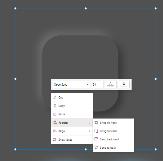
We are nearly there! All we need to do now, is just layer our items on top of each other (think a 🍔). The bottom layer will be our HTML control, the middle will be our SVG, and the top will be our button.
Right click on the HTML control, and hover over ‘Reorder’ and press ‘Bring to front’.
Now right click on the SVG, and do the same. Then layer the SVG on top of your HTML control. You may need to manipulate the Y and X axis to make sure it fits in the middle.
And… are you ready?! Here’s our finished product🤩
Now I know what you might be thinking - this took sooooooo long to build. I promise you - this is only because you did it for the first time. It takes around 2 minutes to do it, and you’ll soon also be able to download a component from my Git that will do this for you.
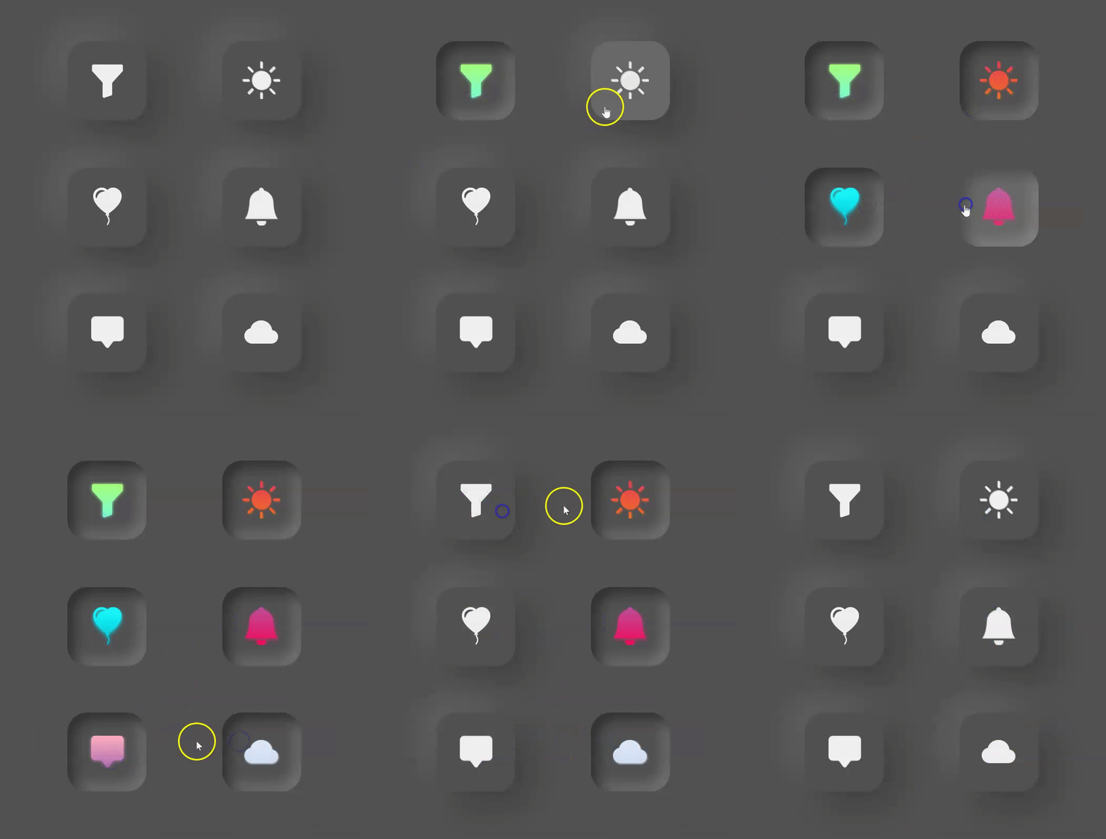
Here’s a few buttons grouped together with some additional lineal gradient which I will be teaching you soon!
I hope you enjoyed this SUPER LONG blog post and learned something new! Don’t forget to subscribe if you’d like to be notified of my next post.
Thank you so much for visiting if you decide to build a button like this, don’t forget to tag me - I’d absolutely love to see what you build!😊


