Building beautiful buttons in Canvas Apps part 1 - neumorphic buttons
Welcome to my next series focusing on UI/UX in Power Apps. This series will focus on beautiful buttons in Canvas Apps and similarly to the navigation menu series, in the last part we will wrap up our work in a component that we can reuse in our Canvas Apps😊
Thoroughout this series, we will look at various design concepts (Neumorphism, Fluent UI, Boostrap etc.) and how we can build those buttons in Canvas Apps.
For today’s post, we will tackle neumorphism (also known as soft UI). It is a new design framework which was developed at the end of 2019 and became popular in 2020. Its aesthetic is very minimal and real-life like UI to replicate ‘button-like’ experience. Neumorphism is all about the color of the entire screen, and delivering an entirely unique experience for users. The main focus of neumorphism is on box-shadow to give a feel that buttons are actually inside the background for a 3D like feel. One thing to note is that neumorphism is very monochromatic by nature and can cause accessibility issues - the key here is to make sure that there is enough contrast between your text/icons and background and ensure that you use some flat elements too - similarly to how Nick Black has outlined here.
Our buttons will consist of three controls:
Button control - we will layer this on top of our HTML and image.
HTML control - this will contain the <div> with the box shadows and other styling,
Image control - this will contain the SVG code,
As with my previous posts, please do not worry if you’re not familiar with using a HTML control or SVG’s - I will go over this in as much detail as possible to make it easy to understand regardless of your background knowledge and all code snippets will be included.
Firstly, let's set our background menu to be RGBA(237,237,237,1) which will be a very light grey colour.
Let’s start with a button. Our button will be transparent and layered over the image and the HTML control. To create the transition of the box-shadow to inset (make the button like it’s been pressed), we will be using a contextual variable. It will also be responsible for the colour of our SVG.
Please update the following properties:
Tooltip - specify what this button will do when pressed to make it accessible to screen readers and also clarify to users what your button will be responsible for,
Fill - set this to Transparent,
Text - remove ‘Button’ text and leave this blank,
HoverFill - this will be our favourite colour that you might recognise from my previous post - RGBA(196,196,196,0.2)
PressedFill - this will also be the same colour, just with less transparency - RGBA(196,196,196,0.5)
BorderRadius - we want the corners to be round-ish so please set this to 25px,
Height and Width - please set both to 100px,
OnSelect - this is where our contextual variable will be located. To set a contextual variable (that will work on this screen only) we will use the UpdateContext() function. If a button is pressed, we want it to appear ‘pressed’. If it’s clicked on again, it should return to its original state. Our formula will look like this - UpdateContext({pressedbutton: !pressedbutton})
As our button is transparent, there’s nothing to see here (yet!).
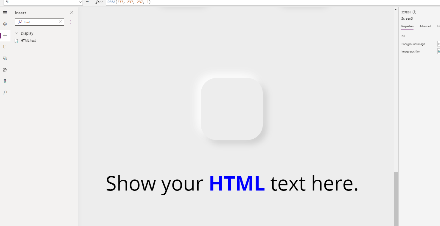
To build the base of our control, we are using the HTML control. HTML control is a fantastic way to inject additional styling using inline CSS that you would not otherwise be able to achieve natively in Power Apps. Our baseline control will look like the below. A bit of box shadow, a bit of border radius, and it’s ready!
To start with, we need to add the HTML control to our canvas (it works seamlessly in both the full version of Power Apps maker studio as well as the Teams version). You will then be greeted with some default text. As it is a HTML control, the text itself has some inline formatting applied to it.
<"Show your <b><font color=blue>HTML</font></b> text here."
We are now ready to add a ‘box’ to our screen, or more precisely - a <div>. This is where our code will reside and what will drive the design of our button. In one of my previous posts, I’ve detailed how to use the HTML control if you’d like to check it out!
"<div style=' <— opening tag —>
margin: 30px; <— as we are using box shadow with some blur, we need to change the margin to ensure that the box shadow doesn’t get cut off with a straight line —>
width: 100px; <— width of our control —>
height: 100px; <— height of our control —>
box-shadow: -6px -6px 14px rgba(255, 255, 255, .7),
-6px -6px 10px rgba(255, 255, 255, .5),
6px 6px 8px rgba(255, 255, 255, .075),
6px 6px 10px rgba(0, 0, 0, .15); <— our multitonal box-shadow —->
border-radius:25px' > <— let’s give our control some rounded corner —>
</div>" <— closing tag —>
The snippet should look like this:
"<div style='
margin:30px;
width:100px;
height:100px;
box-shadow: -6px -6px 14px rgba(255, 255, 255, .7), -6px -6px 10px rgba(255, 255, 255, .5), 6px 6px 8px rgba(255, 255, 255, .075),6px 6px 10px rgba(0, 0, 0, .15);
border-radius:25px'>
</div>"
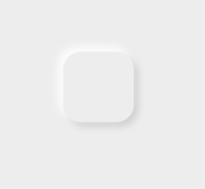
Your control should now look like this:
As we want the box shadow to change dynamically as we press the button, we will need to add our contextual variable and an If() statement to our code snippet. You’ll remember from my previous posts that in order to reference anything outside of the code, we need to use “&.
Here’s the structure of our snippet:
"<div style='
margin: 30px;
width: 100px;
height: 100px;
box-shadow: “& <— opening ‘tag’ to reference a formula in code —>
If(pressedbutton = false, <—- our if statement—>
“ -6px -6px 14px rgba(255, 255, 255, .7),
-6px -6px 10px rgba(255, 255, 255, .5),
6px 6px 8px rgba(255, 255, 255, .075),
6px 6px 10px rgba(0, 0, 0, .15)“ , <— the box shadow of our control if the button hasn’t been pressed —>
inset -2px -2px 4px rgba(255, 255, 255, .5),
inset 2px 2px 2px rgba(255, 255, 255, .075),
inset 2px 2px 4px rgba(0, 0, 0, .15)" ) <— the box shadow of our control if the button has been pressed—>
&" <— closing ‘tag’ —>
; <— don’t forget the semi-colon! —>
border-radius:25px' >
</div>"
Completed snippet:
"<div style='margin:30px;width:100px;height:100px;

"& If(pressedbutton = false," box-shadow: -6px -6px 14px rgba(255, 255, 255, .7),
              -6px -6px 10px rgba(255, 255, 255, .5),
              6px 6px 8px rgba(255, 255, 255, .075),
              6px 6px 10px rgba(0, 0, 0, .15)",  "box-shadow: inset -2px -2px 6px rgba(255, 255, 255, .7),
              inset -2px -2px 4px rgba(255, 255, 255, .5),
              inset 2px 2px 2px rgba(255, 255, 255, .075),
              inset 2px 2px 4px rgba(0, 0, 0, .15)" ) &"    ;
     border-radius:25px'></div>"
Now let’s do a bit of testing! If you press the button we created before, you should see that it is working beautifully 🤩
Feel free to layer your button on top of the control now, although I’d probably suggest doing it at the very end!
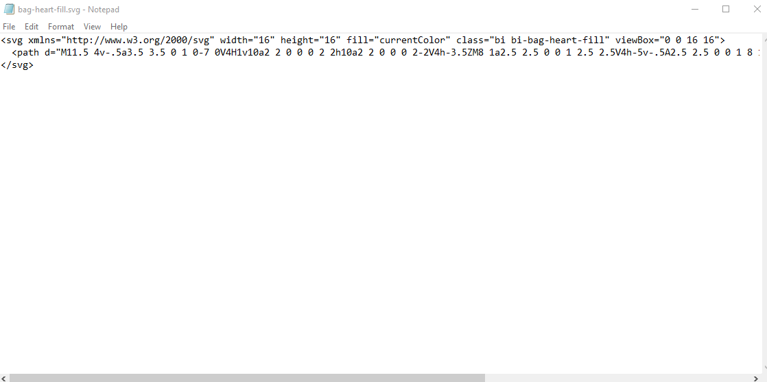
Last piece of the puzzle is our SVG control. To get the SVG, we will use the Bootstrap website I shared in my SVG blog post. Feel free to use any icon you like - I’m going to use a bag with a heart on it (bag-heart-fill) because why not!
Click on Download SVG and then open it with VS Code or Notepad. I’ll use notepad just because not everyone will have VS Code on their PC’s.
You’ll remember from my SVG blog post that we will now need to replace all double quotes (“) with single quotes (‘). To do this, press CTRL + H on your keyboard (or click Edit, and then Replace) and then type “ in the first line, and ‘ in the second line, then click ‘Replace all’.
Great! To add an SVG to Power Apps, we have to use the mime type (“data:image/svg+xml;utf8,”) and then a PowerFx function EncodeUrl at the beginning of our code. Here’s the structure of the snippet:
"data:image/svg+xml;utf8, "&EncodeUrl(" <— opening of our SVG formula —>
<svg xmlns='http://www.w3.org/2000/svg' width='16' height='16' fill='currentColor' class='bi bi-bag-heart-fill' viewBox='0 0 16 16'>
<path d='M11.5 4v-.5a3.5 3.5 0 1 0-7 0V4H1v10a2 2 0 0 0 2 2h10a2 2 0 0 0 2-2V4h-3.5ZM8 1a2.5 2.5 0 0 1 2.5 2.5V4h-5v-.5A2.5 2.5 0 0 1 8 1Zm0 6.993c1.664-1.711 5.825 1.283 0 5.132-5.825-3.85-1.664-6.843 0-5.132Z'/>
</svg> <-- SVG code goes here -->
") <-- don’t forget to add this at the end of our code -->
The ready snippet should look like this (with the icon I downloaded):
"data:image/svg+xml;utf8, "&EncodeUrl("
<svg xmlns='http://www.w3.org/2000/svg' width='16' height='16' fill='currentColor' class='bi bi-bag-heart-fill' viewBox='0 0 16 16'>
  <path d='M11.5 4v-.5a3.5 3.5 0 1 0-7 0V4H1v10a2 2 0 0 0 2 2h10a2 2 0 0 0 2-2V4h-3.5ZM8 1a2.5 2.5 0 0 1 2.5 2.5V4h-5v-.5A2.5 2.5 0 0 1 8 1Zm0 6.993c1.664-1.711 5.825 1.283 0 5.132-5.825-3.85-1.664-6.843 0-5.132Z'/>
</svg>
")
Before we add this to our Power App, let’s also take care of the dynamic colour. We want the icon to be dark grey when it’s not been pressed, and change colour when it has been pressed. As we have a light grey background, we need to ensure that the colour we choose has enough contrast with the background and meets at least AA compliance in line with WCAG accessibility standards. If you’re not sure if your colour does - use this website to check.
The colour we will use for this blog post is #005A9E, a blue colour which is AA compliant with our background and can be used for graphical objects and user interface components.
To implement dynamic colours, we will need to use another If() statement referencing our contextual variable. This will need to be placed in the fill property of your SVG. Again, as we are referencing something outside of our code, we will need to use “& at the beginning and then &” to close the statement. Here’s what it will look like in our code:
"data:image/svg+xml;utf8, "&EncodeUrl("
<svg xmlns='http://www.w3.org/2000/svg' width='16' height='16'
fill= ' “& If(pressedbutton = false, “rgb(96,96,96,1)”, “#006EC2”) &” ' <— if the button hasn’t been pressed, we want the colour to be dark grey, if it has - we want it to be our blue colour —>
class='bi bi-bag-heart-fill' viewBox='0 0 16 16'>
<path d='M11.5 4v-.5a3.5 3.5 0 1 0-7 0V4H1v10a2 2 0 0 0 2 2h10a2 2 0 0 0 2-2V4h-3.5ZM8 1a2.5 2.5 0 0 1 2.5 2.5V4h-5v-.5A2.5 2.5 0 0 1 8 1Zm0 6.993c1.664-1.711 5.825 1.283 0 5.132-5.825-3.85-1.664-6.843 0-5.132Z'/>
</svg>
")
Here’s the complete snippet:
"data:image/svg+xml;utf8, "&EncodeUrl("
<svg xmlns='http://www.w3.org/2000/svg' width='16' height='16' fill= ' "& If(pressedbutton = false, "rgb(96,96,96,1)", "#006EC2") &" '  class='bi bi-bag-heart-fill' viewBox='0 0 16 16'>
  <path d='M11.5 4v-.5a3.5 3.5 0 1 0-7 0V4H1v10a2 2 0 0 0 2 2h10a2 2 0 0 0 2-2V4h-3.5ZM8 1a2.5 2.5 0 0 1 2.5 2.5V4h-5v-.5A2.5 2.5 0 0 1 8 1Zm0 6.993c1.664-1.711 5.825 1.283 0 5.132-5.825-3.85-1.664-6.843 0-5.132Z'/>
</svg>
")
Here’s the result so far:
We are nearly there! All we need to do now, is just layer our items on top of each other (think a 🍔). The bottom layer will be our HTML control, the middle will be our SVG, and the top will be our button.
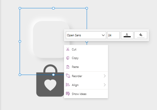
Right click on the HTML control, and hover over ‘Reorder’ and press ‘Bring to front’.
Now right click on the SVG, and do the same. Then layer the SVG on top of your HTML control. You may need to manipulate the Y and X axis to make sure it fits in the middle.
And lastly - do the same for our button.
And it’s done!! Here’s our final result 🤩
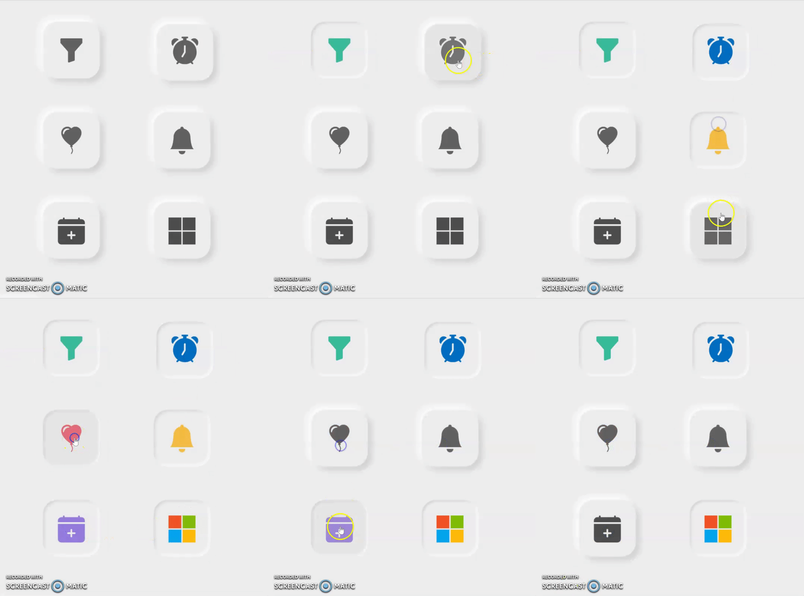
And here are some other buttons I have built using this same method 😊
Hope you enjoyed this episode! If you’d like to get notified of the next one, please make sure you subscribe below. Thank you for visiting😊


