
PowerHack🔮 #5 - how to quickly add 80+ charts to your apps and custom pages

Welcome to another PowerHack!🔮 Today we will have a look at how you can quickly add charts to your Power Apps and custom pages without the need to use Power BI or the out-of-the-box charts!
If you’ve used the image control before, you will probably already know that you can render external images as long as they are publicly available and do not require any authentication. All you need to do is wrap the image address in double quotes. Here’s a quick example:

Stunning New York!
What if I told you that there’s an API that allows you to get images of charts in your apps and custom pages in seconds? If you’re a developer, you’ll likely already be familiar with Chart.js. Chart.js is an open source JavaScript library and is one of the easiest and simplest data visualisation libraries that supports many types of charts.
Now, there’s an API called quickchart.io that allows you to render those charts as images without having to write a single line of JS. Super cool, right?!
Let’s have a look at how it works. Firstly, please add an image control to your screen.
Now, let’s have a look at QuickChart. As you open the website, we are greeted with a sample chart and the URL.
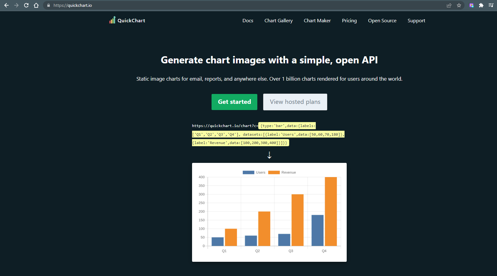
Let’s copy it and paste it into our app - don’t forget to wrap it in double quotes. Here’s the snippet:
"https://quickchart.io/chart?c={type:'bar',data:{labels:['Q1','Q2','Q3','Q4'], datasets:[{label:'Users',data:[50,60,70,180]},{label:'Revenue',data:[100,200,300,400]}]}}"
And here’s the result:
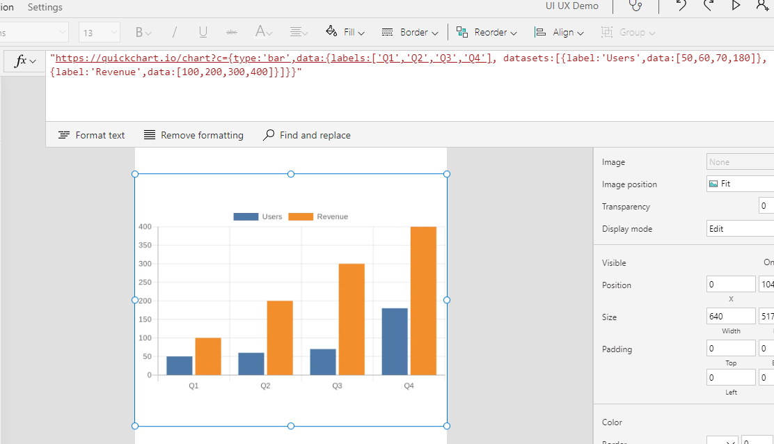
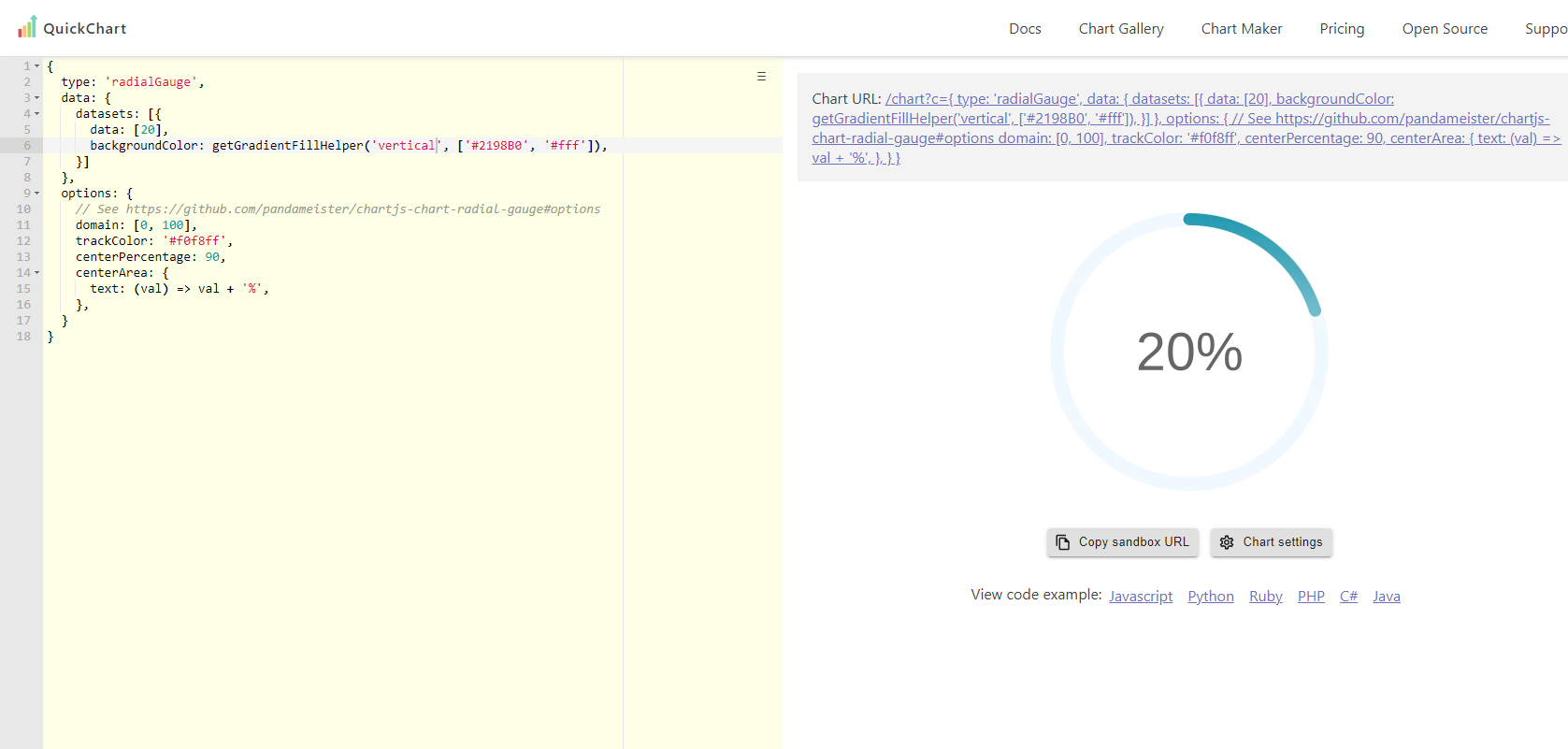
Super cool and quick! Let’s have a look at one of the other charts they have available and connect it to some data. For today’s demo, I’m going to show you a radial gauge.
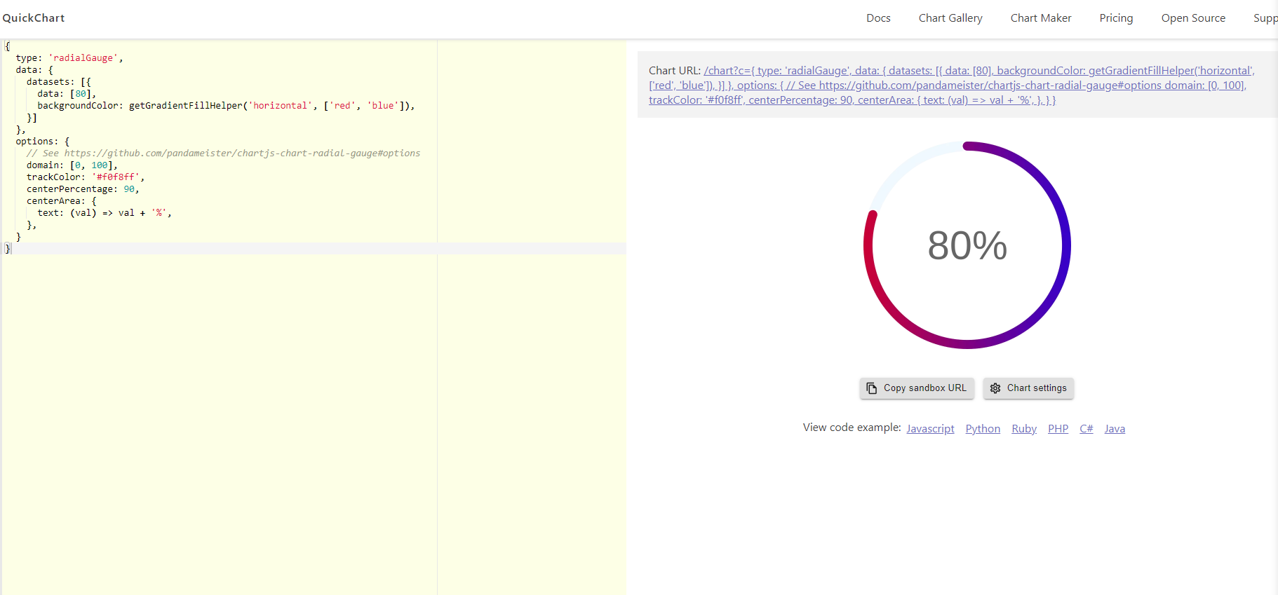
As you’ll see above, to the left we have a very simple code editor with the JSON already generated for us and to the right we have the chart itself. You can easily start changing colours, values etc. and see the results immediately. As a quick demo, let’s change the data from 80 to 20 and the backgroundColour to a mint blue and white combination (#2198B0 and #fff) and the alignment of our linear gradient from horizontal to vertical.
{
type: 'radialGauge',
data: {
datasets: [{
data: [20],
backgroundColor: getGradientFillHelper('horizontal', ['#2198B0', '#fff']),
}]
},
options: {
// See https://github.com/pandameister/chartjs-chart-radial-gauge#options
domain: [0, 100],
trackColor: '#f0f8ff',
centerPercentage: 90,
centerArea: {
text: (val) => val + '%',
},
}
}
The complete snippet:
{

  type: 'radialGauge',

  data: {

    datasets: [{

      data: [20],

      backgroundColor: getGradientFillHelper('vertical', ['#2198B0', '#fff']),

    }]

  },

  options: {

    // See https://github.com/pandameister/chartjs-chart-radial-gauge#options

    domain: [0, 100],

    trackColor: '#f0f8ff',

    centerPercentage: 90,

    centerArea: {

      text: (val) => val + '%',

    },

  }

}
And the result:
Perfect! Now let’s build the URL itself to get the image chart.
If you look at the structure of the sample snippet we used in the beginning, you’ll see that it has two parts -
https://quickchart.io/chart?c= —-> this is our endpoint URL
{type:'bar',data:{labels:['Q1','Q2','Q3','Q4'], datasets:[{label:'Users',data:[50,60,70,180]},{label:'Revenue',data:[100,200,300,400]}]}} —-> these our query parameters
Now while our sample chart worked seamlessly by just copying and pasting the code from the website, some of the charts may not render correctly. if you look in the docs, you’ll see a warning that image charts should be URL-encoded to ensure they are rendered correctly.

Luckily, we have an EncodeUrl function in PowerApps which means that we will not run into any issues. EncodeUrl function will effectively encode our URL string and convert ‘unsafe’ characters into a format that can be transmitted over the Internet (in an ASCII format). Here’s the reference for the EncodeUrl function in Power Apps, and here’s the reference to the HTML URL encoding if you’d like to fully understand the topic itself.
The structure of our URL with EncodeUrl will look like this:
“ - wrap the image in double quotes
https://quickchart.io/chart?c= - the endpoint URL,
“& - we are referencing something outside of the code (which is in plain text) so we need to use this in our syntax
EncodeUrl(“ —-> the PowerFx function
{
type: 'radialGauge',
data: {
datasets: [{
data: [20],
backgroundColor: getGradientFillHelper('vertical', ['#2198B0', '#fff']),
}]
},
options: {
// See https://github.com/pandameister/chartjs-chart-radial-gauge#options
domain: [0, 100],
trackColor: '#f0f8ff',
centerPercentage: 90,
centerArea: {
text: (val) => val + '%',
},
}
} —-> our parameters copied from the code editor
“) —-> closing the EncodeUrl function
&” ——> closing the PowerFx reference
“ —-> closing the URL
Here’s the complete snippet:
"https://quickchart.io/chart?c="& EncodeUrl("{
  type: 'radialGauge',
  data: {
    datasets: [{
      data: [20],
      backgroundColor: getGradientFillHelper('vertical', ['#2198B0', '#fff']),
    }]
  },
  options: {
    // See https://github.com/pandameister/chartjs-chart-radial-gauge#options
    domain: [0, 100],
    trackColor: '#f0f8ff',
    centerPercentage: 90,
    centerArea: {
      text: (val) => val + '%',
    },
  }
}")
&"
"
And here’s the result in one of my previously demoed apps:
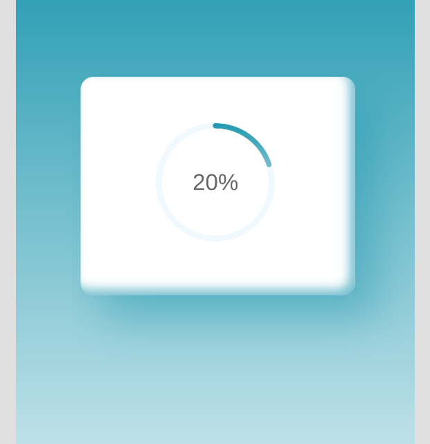
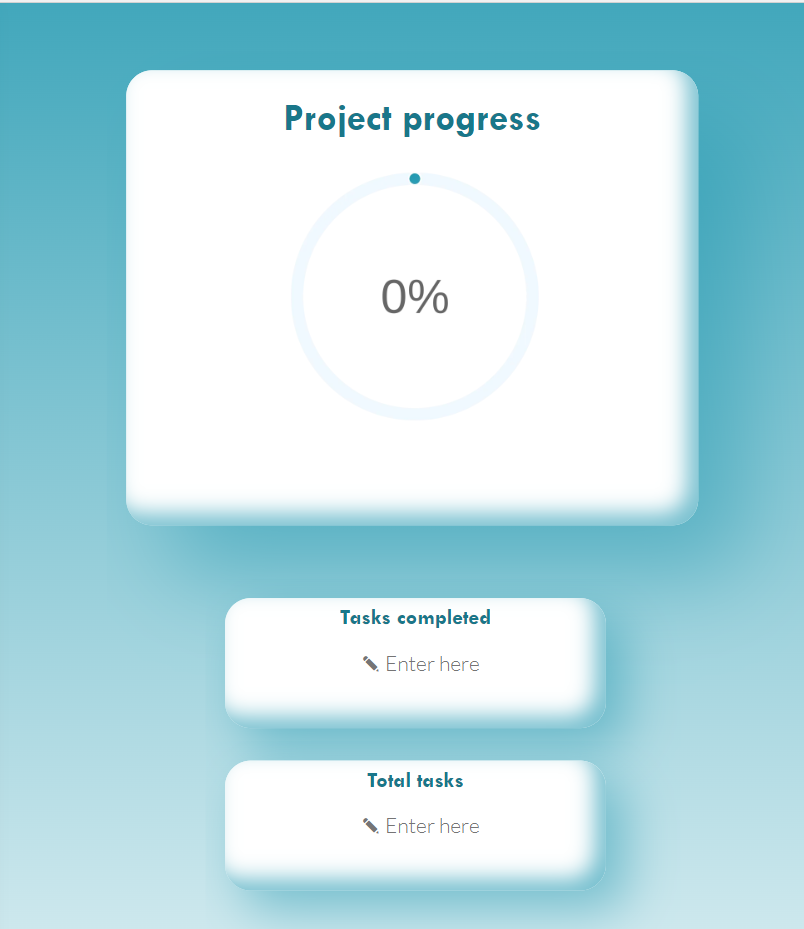
Looks so pretty! Now let’s actually connect it to some data. For today’s demo, I will use two text inputs and the following use case - we have tasks to complete for our project (total tasks), and we want the chart to show the percentage completed based on the other text input (completed tasks). Let’s add two text inputs to our screen and rename them to txtinpTotal and txtinpCompleted.
Now, let’s update our code so that the values change dynamically based on the text inputs. In our code editor, we are going to update just one line - the data. As we are calculating percentage, we will have to perform a simple calculation:
(Tasks completed/total amount of tasks) *100
"https://quickchart.io/chart?c="& EncodeUrl("{
type: 'radialGauge',
data: {
datasets: [{
data: [“& (txtinpCompleted.Text/txtinpTotal.Text)*100 &” ], ——> this is where the calculation will go. Don’t forget the “& as we are referencing values outside of the code.
backgroundColor: getGradientFillHelper('vertical', ['#2198B0', '#fff']),
}]
},
options: {
// See https://github.com/pandameister/chartjs-chart-radial-gauge#options
domain: [0, 100],
trackColor: '#f0f8ff',
centerPercentage: 90,
centerArea: {
text: (val) => val + '%',
},
}
}")
&"
"
Here’s the complete snippet:
"https://quickchart.io/chart?c="& EncodeUrl("{
  type: 'radialGauge',
  data: {
    datasets: [{
      data: ["& (txtinpCompleted.Text/txtinpTotal.Text)*100 &"],
      backgroundColor: getGradientFillHelper('vertical', ['#2198B0', '#fff']),
    }]
  },
  options: {
    // See https://github.com/pandameister/chartjs-chart-radial-gauge#options
    domain: [0, 100],
    trackColor: '#f0f8ff',
    centerPercentage: 90,
    centerArea: {
      text: (val) => val + '%',
    },
  }
}")
&"
"
And here’s the final result! 🤩
Before we finish off, there are a couple of limitations to be aware of:
as the chart is rendered as an image, it is not interactive - you cannot add hover tooltips etc. You can however create dropdowns etc. to filter through the chart values.
there is no way to animate the chart as it is rendered as a static image and we cannot add any CSS files or even inline styling.
The API is free however there is a limit of 90 calls per 10 seconds per IP address - this one is worth noting. While it is unlikely to affect you, even if you are using corporate VPN, it’s good to know.
If you’d like to learn more about the QuickChart API and see how other charts work - I have a YouTube video coming up on this in due course! Don’t forget to subscribe to my YouTube channel if you’d like to get notified when the video goes live!
I hope you enjoyed today’s hack! If you’d like to get notified of future hacks and my other posts, don’t forget to subscribe to my newsletter below!
Thank you for being here 😊