
PowerHack🔮 #3 Two ways of implementing a gradient background in Canvas Apps

Welcome to another #PowerHack🔮 episode and taking your UI/UX in Canvas Apps to next level! In today’s post, I will show you how to achieve a gradient background using two completely different methods. Let’s get started!
Gradients are a great way to add colour, depth and subtle eye-catching effects to your design. They can also help you direct users’ attention to a specific item in your screen thus increasing user experience. And they just look cool, right?!
Now there is one key thing to note about gradient backgrounds - as they are made up of more than one colour, you need to ensure that BOTH colours meet the colour contrasts with your foreground text in line with WCAG Accessibility Guidelines. You can use this contrast checker to double check.
At present, there is no native way to implement a gradient in your app with the Background Fill property as it only accepts single colour values. One method would be going to a website like Unsplash, typing ‘abstract’ in the search bar and downloading one of the gradient backgrounds as an image and then uploading to your Power App. Why do I not recommend this method?
Firstly, those images tend to be very heavy in size. Some of them can be up to 10mb depending on the quality. Now if you upload this image to your app, it’s going to affect the loading time of the app to start with as the host will need to process that photo every time the app has been launched. If you have an application that’s connecting to multiple data sources and performing a lot of operations, your app will be VERY SLOW.
Secondly, if you add that photo as a background of every screen in your app, when your users navigate to a screen, they will see that background image load up as they open the screen - so firstly they’ll see white background, and then the image will render. Not the best user experience.
What are the other methods then? Using my two favourite controls…
First method - HTML control
We will use an inline style to give us a nice lineal gradient background. To inject inline CSS, we will use a HTML control.
Firstly, let’s add a HTML control to our screen.
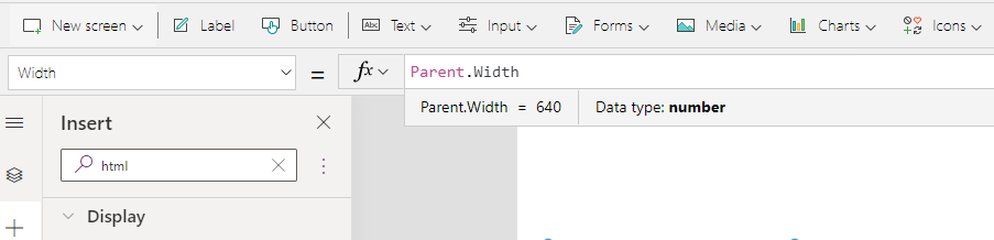
As we want the background to be responsive, let’s change the properties of our HTML control to be:
Width - Parent.Width
Height - Parent.Height
Now, similarly to my previous posts, let’s add a simple <div> element. As we want the contents of the div to be responsive too, we need to make sure that the width and height of the actual div are scalable too.
Our div will have a very simple structure:
“ ——-> don’t forget double quotes!
<div style=’ ——> opening tag
width: ; ——> width of our background
height: ; ——> height of our background
background: ; ——> colour of our background
‘> ———> closing bracket
</div> ———> closing tag
” ——> don’t forget double quotes!
We will assign the following properties:
Width - 100%,
Height - Parent.Height. Now you’ll remember from my previous posts that in order to reference something from the app within the HTML control, we have to use “& to open the reference, and &” to close it. (“& Parent.Height &”). Now because this value will be in pixels, we need to make sure we add ‘px’ at the end of that reference. Example: “& Parent.Height &”px;
Background - we will temporarily give it a blue colour.
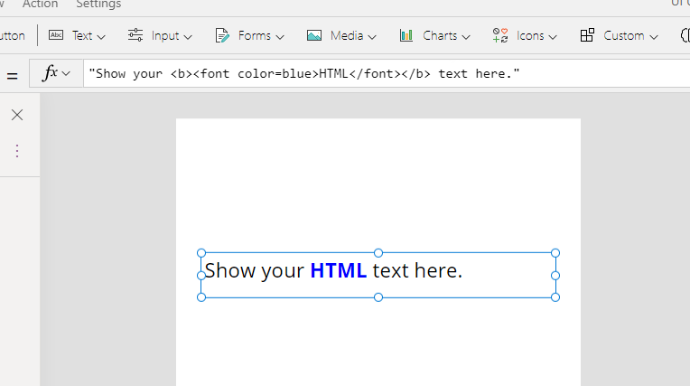
Here’s the snippet:
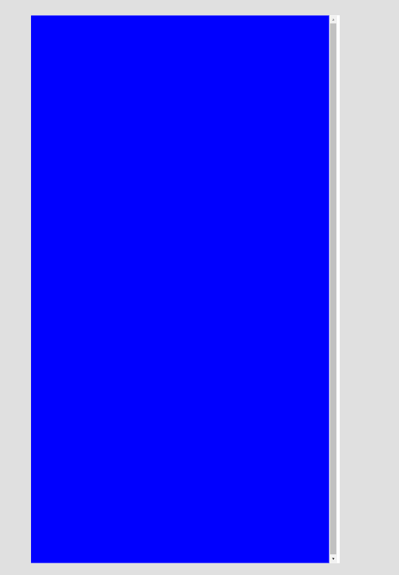
"<div style='width: 100%;
 height: "& Parent.Height &"px;
 background: blue'>
 </div>"
And this is the result - so pretty, right?! NOT 😜

As you can see, there are two main issues here :
We can see white lines around the edges even though the width and height are responsive. How’s that possible you may ask? I’ll show you in a moment!
The scrollbar - the HTML control is now telling the app that it’s too large to fit in the screen causing the scroll bar to appear. How’s this possible if both the width and height of the screen are linked to the Parent width and height properties? You guessed right.. it is another small glitch from Power Apps.
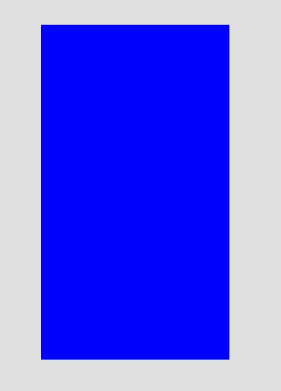
To fix the first issues, all we need to do is change the padding of the actual HTML control. By default, when we add it to the screen, it will have 5px padding applied around all 4 edges.

All you need to do is set the padding of all 4 edges to 0px. Here’s the result:
No more white edges!
Now, let’s tackle the scroll bar. To fix this, we will need to revisit our small code snippet and reduce the size slightly so that it renders full screen but without the scroll bar. All we need to do is a simple maths equation - deduct 1px from height. Yes, that simple!
"<div style='width: 100%;
 height: "& Parent.Height - 1 &"px;
 background: blue'>
 </div>"
Here’s the complete code snippet:
"<div style='width: 100%; height: "& Parent.Height - 1 &"px; background: blue'> </div>"
And here’s the result:
Much better!
Now, let’s apply the gradient. There are different types of gradients, and for today’s demo we will use lineal-gradient just because I think it works best for backgrounds. Feel free to use other gradients if you like! Now, to make our lives easier, we are going to get lineal gradient code snippets from one of my favourite websites - uiGradients. It has a number of pre-generated beautiful gradients that we can just paste into our code. Please however feel free to create your own if you’re feeling creative! Here’s a starter guide for you.
When you navigate to the uiGradients website, you will be landed on a random gradient. Please click on ‘Show all gradients to the top left of your screen and you will be greeted with lots of beautiful gradients.
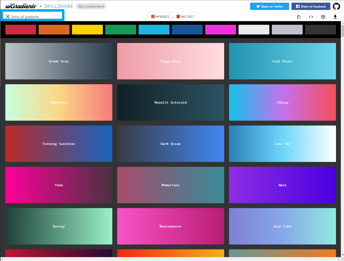
For today’s demo, I will be using a gradient called Nimvelo. Click on the code brackets symbol in the top right of your screen.

You will then have a pop up window with the code snippets. From the third line, please copy only the code highlighted below - lineal-gradient(your colours);

Now all we need to do, is replace the ‘blue’ in our HTML control, with the copied code.

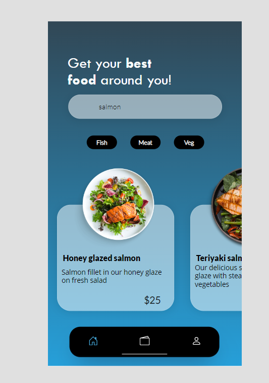
How much nicer does it look? 🤩
And here’s our work in the app itself:
Method 2 - SVG
This one is actually my preferred method over HTML control as it allows more control over the code and allows us to do things like animations etc. Now originally I was going to show you how to do this from scratch however as not everyone reading this blog post is a developer or just generally comfortable with SVG’s, we will cheat a little and use a generator! For the purposes of this post, I have found this generator which seems to do a great job and doesn’t require any sign ups etc. It allows us to create a gradient using a WYSIWG generator and download it as an SVG.
[EDIT: My Power Apps friend Craig has also suggested another SVG gradient generator that he’s been using by Angry Tools which also allows you to copy the SVG code directly from the website. Don’t forget to replace the double quotes before you paste it in 😉Thank you Craig!]

This tool allows you to add multiple layers of gradients. Here’s mine - not the most adventurous, I know! One thing I always recommend is to never overdo your background. It should be complementary to your app, not overpowering and taking attention of your users.
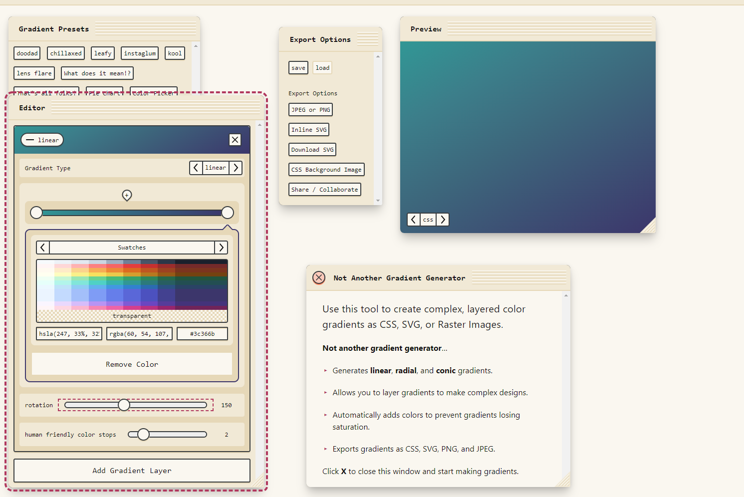
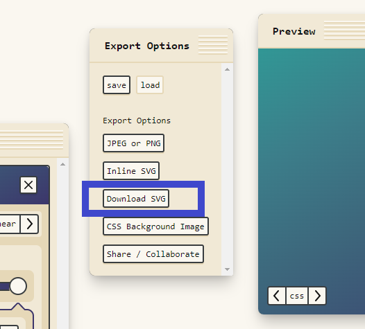
Once you’re happy with it - please click on Download SVG. You’ll have a pop up with some measurement options and preset sizes - just ignore them and click on ‘Download SVG’ again.
This will now download the SVG file. Please open it with a notepad and you’ll be greeted with the following code:

You’ll remember from one of my posts, that we will need to replace all of the double quotes with single quotes first. To do this, press CTRL + H on your keyboard (or click Edit, and then Replace) and then type “ in the first line, and ‘ in the second line, then click ‘Replace all’.

Now before we wrap the code up in a Power FX function, there’s one thing I’ve noticed with this generator - the first line of code with the xml version will stop the SVG from rendering it in Power Apps. The SVG’s in Power Apps will only work when the code starts with the namespace (xmlns). All we need to do is just remove the first line of code (sorry if the previous sentence scared you off 😉).
Now you’ll also remember from my previous posts, that in order to add the SVG into our app, we will need to wrap it up in an EncodeURL function.
"data:image/svg+xml;utf8, "&EncodeUrl(" <-- OUR SVG CODE GOES HERE --> <-- DON'T FORGET TO ADD DOUBLE QUOTES AND CLOSING BRACKET AT THE END OF THE CODE --> ")

And here’s the snippet for my particular gradient:
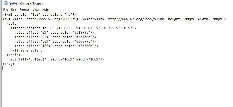
"data:image/svg+xml;utf8, "&EncodeUrl("
<svg xmlns='http://www.w3.org/2000/svg' xmlns:xlink='http://www.w3.org/1999/xlink' height='200px' width='200px'>
  <defs>
    <linearGradient id='0' x1='0.25' y1='0.07' x2='0.75' y2='0.93'>
      <stop offset='0%' stop-color='#319795'/>
      <stop offset='25%' stop-color='#3c7e8a'/>
      <stop offset='50%' stop-color='#3d677c'/>
      <stop offset='100%' stop-color='#3c366b'/>
    </linearGradient>
  </defs>
  <rect fill='url(#0)' height='100%' width='100%'/>
</svg>
")
Now we are ready to add it to the app. Firstly, please add an image control to your screen.

Now paste the code into the Image property of our Image control.
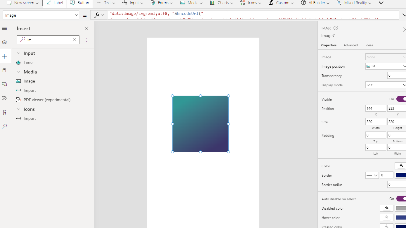
Now, please change the measurement properties, just like we did with the HTML control:
Height - Parent.Height
Width - Parent.Width

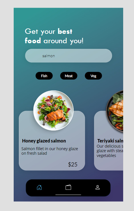
There is one more step we need to do. As the image position is currently set to ‘Fit’, the image will only fill the whole screen. To change this, all we need to do is change the Image position to ‘Fill’. And here’s our beautiful result:

And here’s the gradient in the app - stunning, isn’t it?! 🤩
And we are done! Hope you enjoyed this episode and learned something new. If you’d like to stay up to date with my blog posts, please don’t forget to subscribe below 👇.
And if you have any ideas for what you’d like me to cover - please comment below or drop me a message on LinkedIn! 😊