How to make your Power Apps less ugly in 1 second

I am back to blogging! Writing this blog post took me 20 minutes because I was so excited to start writing again! Thank you for being so patient :)
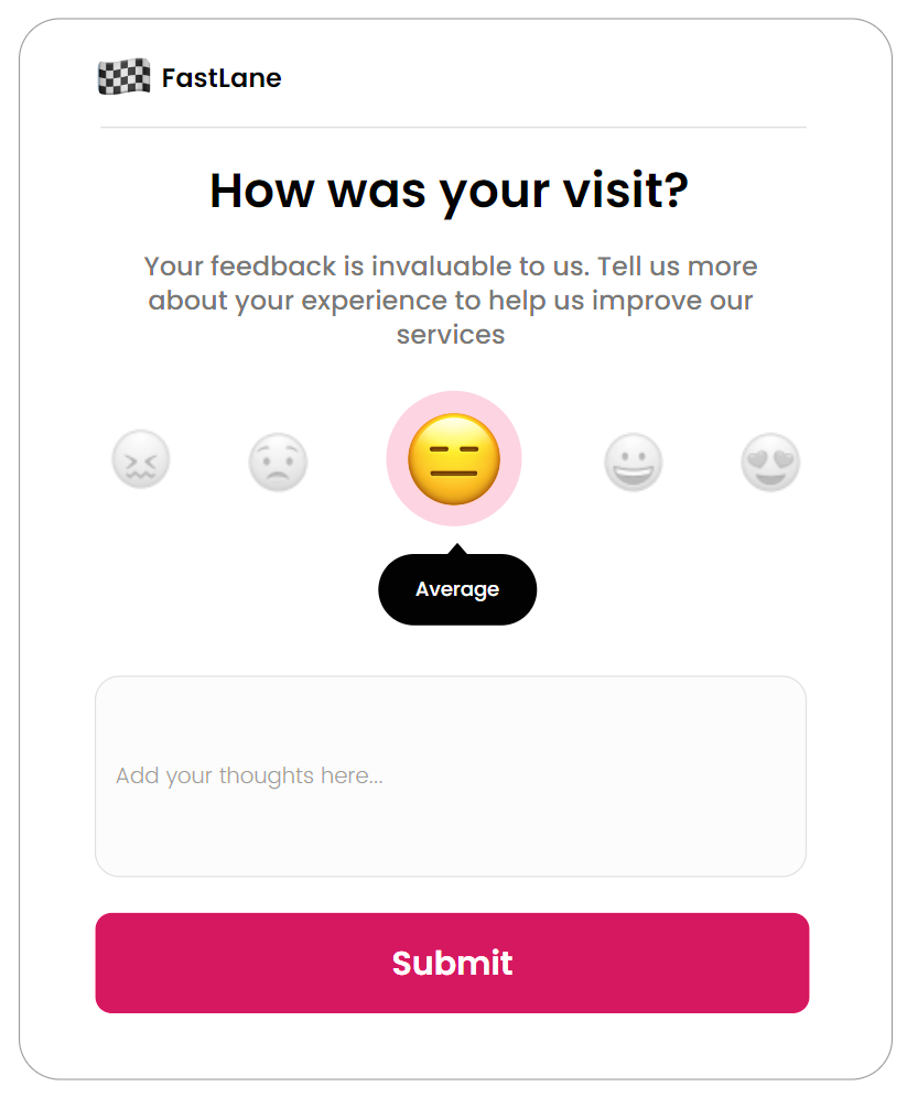
In today’s post, I will show you this one thing that is truly making your apps ugly. Wanna know the good news? It will take you one SECOND to fix it! And if you haven’t guessed from the thumbnail what we are going to talk about… perhaps a visit to the local opticians might help 😉
COLOUR! Yep. Something so simple, yet so powerful, can make or break your applications. Now if you’ve ever started building a Canvas App, you may have been welcomed with these stunning colours (not):
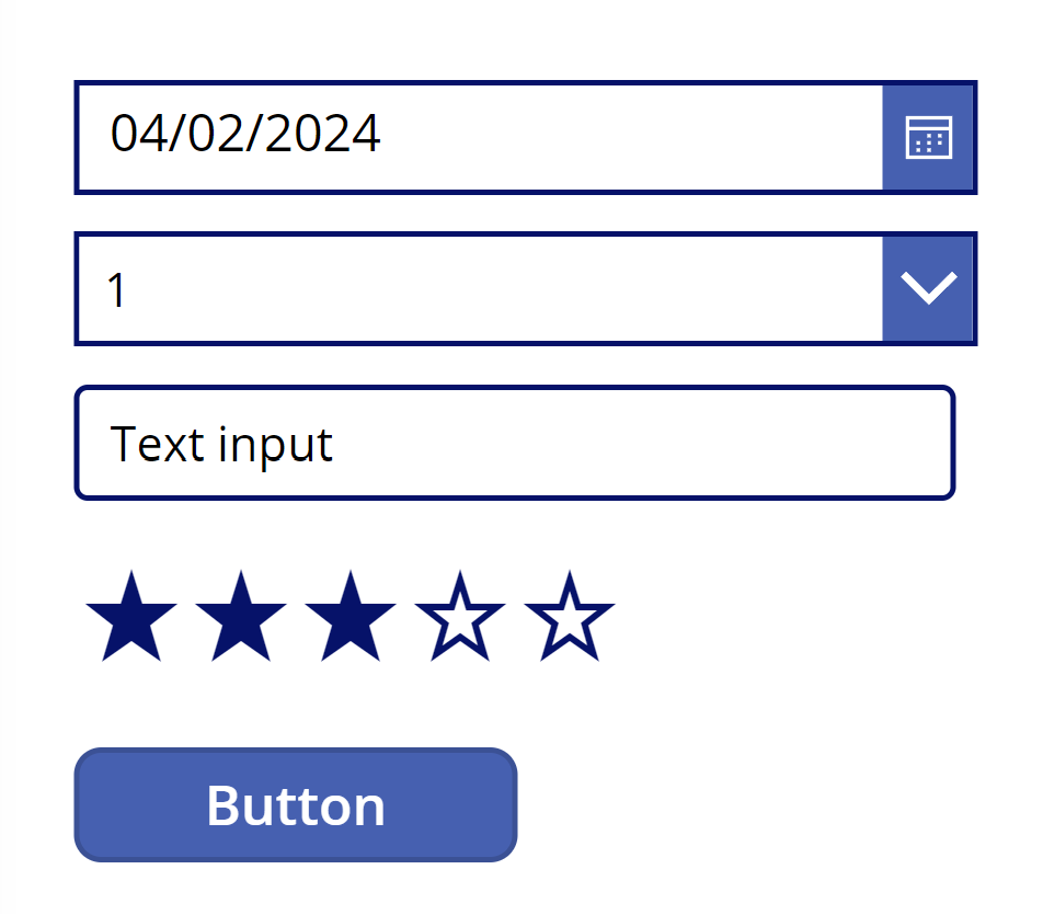
Yep! The ultimate shades of blue, #3860B2 and #00126B. Don’t get me wrong - there’s nothing fundamentally wrong with these two colours. BUT. They look dated, old, 2000s web design like. All other theme colours in the Power Apps studio have same vibe and just don’t present themselves the same way colours in modern applications and websites do, and thus quickly giving the Power App the reputation of very ugly.
Now, we could dive into colour psychology but I am sure you’re not here for it - so let me give you some colours that will instantly elevate your apps in seconds! Follow the 60:30:10 rule for colour distribution and your design will easily be onto a winner! ⭐
Palette 1


Palette 2


Palette 3 (for some reason blog host washes out the green)

Palette 4


Palette 5