
Building a beautiful Power Apps mobile navigation menu - Gallery (part 2)
Welcome back to Part 2! 😊 In this post, we will focus on building out the menu by using the Gallery control which we will then layer on top of the HTML control that we built in the previous post.
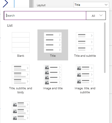
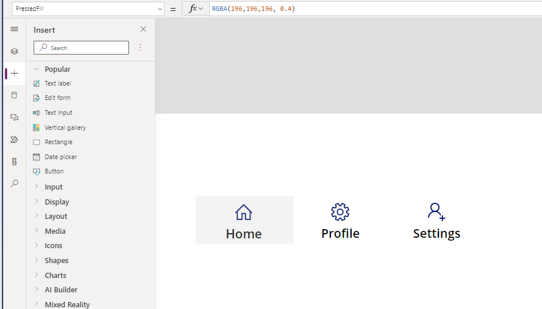
To begin with, we will need to add a Vertical Gallery to your screen.
From the menu to the right, please change the layout of your Gallery to Title only.
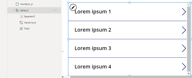
We will also not need the separator that is included out-of-the-box so please remove it from you gallery.
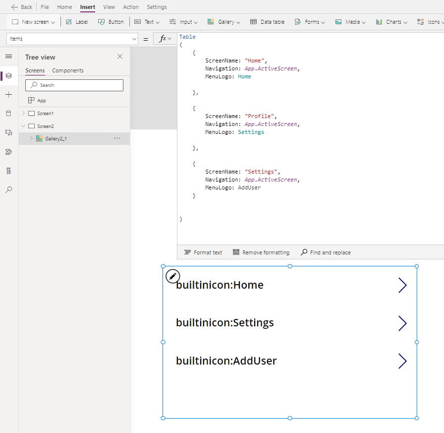
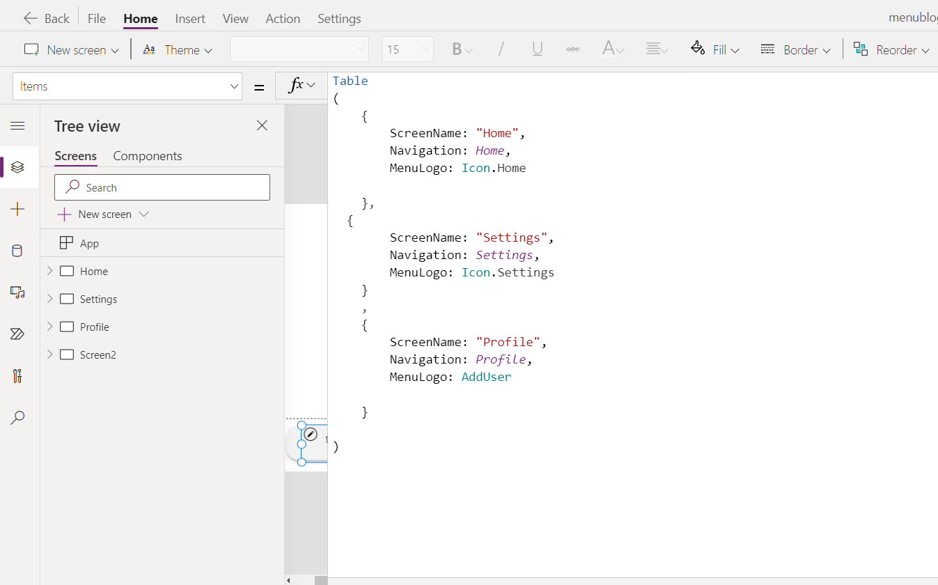
We will then need to provide some items to be displayed in our gallery. To do so, we will construct a very simple table with three items - these will be our menu items. For this post, we will create three screens - Home, My profile and Settings screens. To build the items, we will use the Table() function and create three columns - ScreenName, Navigation and MenuLogo:
ScreenName - this will be the name of the screen in case we want to add a text label to our menu,
Navigation - this will be the screen that we will be navigated to when we select the item. For now, we will set this to App.ActiveScreen.
MenuLogo - this will be the logo for the screen. For this blog post, we will use the built-in icons, but please stay tuned for another post later this week on using SVG’s in our menu! 😍
Table
(
    {
        ScreenName: "Home",
        Navigation: App.ActiveScreen,
        MenuLogo: Home

    },

    {
        ScreenName: "Profile",
        Navigation: App.ActiveScreen,
        MenuLogo: Settings

    },

    {
        ScreenName: "Settings",
        Navigation: App.ActiveScreen,
        MenuLogo: Icon.AddUser
    }


)
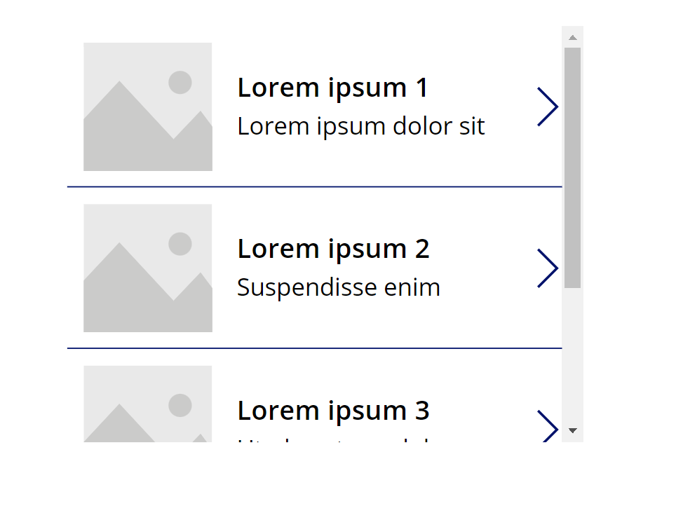
Your Gallery should now look like below. Don’t worry about the icon title, we will change this in a little while.
We will now need to change a couple of properties in our menu:
Wrap count - this should be the amount of items that you are going to have in your menu. For mobile navigation, I always suggest having no more than 5 of those as it will otherwise make it difficult for your user to navigate while on a mobile device. For this post, I’m going to set it to 3.
Template size - This is just to set the size of the menu item. I’m setting this to 100.
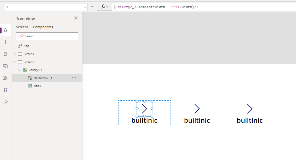
Rename the NextArrow to MenuIcon and Title1 to MenuItem.

Now, let’s move the items in the gallery around. Both the icon and the title of the menu item should be placed exactly in the middle of the template. To do this, you will need to adjust the X property of both the icon and the label to calculate the exact spot. We can do this using a simple formula:
(YourGalleryName.TemplateWidth - Self.Width)/2
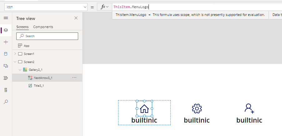
We are now ready to change the title and icon of our menu! We will do this by referencing the table we created earlier within the Items property of our gallery.
For the icon, please change the formula to ThisItem.MenuLogo.
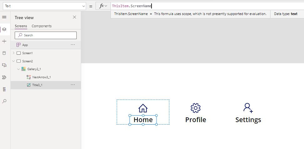
For the title, please change the text property to ThisItem.ScreenName. You will also need to adjust the Align property to Center to ensure the actual text is center-aligned.
To make our menu more interactive and accessible, we will also add a button which will overlay each gallery item and will indicate to the user that they have hovered over an element. Yes, you can use the Transition property in your gallery and set it to Pop/Push, however in my opinion this is too subtle for small mobile screens.
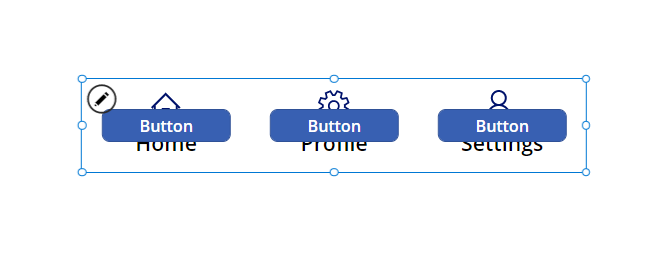
Time to adjust the button. You will need to update the following properties:
Fill - Transparent
Height - YourGalleryName.TemplateHeight (it can be custom height if you wanted to)
Width - YourGalleryName.TemplateWidth (it can be custom width if you wanted to)
Text - Remove ‘Button’ and leave blank
Tooltip - please ensure you do not skip this one as it is key from UX and accessibility perspective. Please set it to "Navigate to " & ThisItem.ScreenName.
HoverFill - RGBA(196,196,196, 0.2) (if you’ve read my previous post, you’ll know this is my favourite colour😉)
PressedFill - RGBA(196,196,196, 0.4)
OnSelect - Navigate(ThisItem.Navigation, Fade) (or any other screen transition you’d like to use)
Your menu should now look like this when you hover over one of the items:
Feel free to hide the label if you don’t want it to be visible. Please however ensure that you have assigned the tooltip as otherwise it will be inaccessible. For today’s demo, I’m going to hide the text label.
We are nearly there. To indicate to our users where they are in your application, we are going to add a circle icon to our gallery.
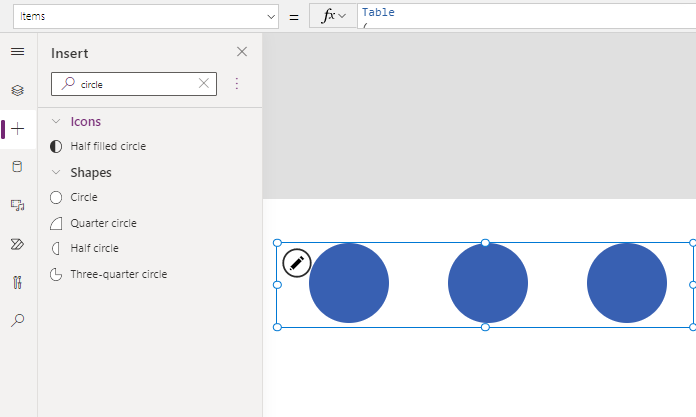
Now we will need to change some of the properties:
X - to place it in the middle - (YourGalleryName.TemplateWidth - Self.Width)/2
Y - to place the circle underneath the menu icon, we will use (MenuIcon.Y + Self.Height + 45). If you set different template size then you will need to adjust this accordingly.
Height & Width - please set both to 20.
Visible - as we only want the circle to be visible for the screen we are currently in, we will change this to If(ThisItem.Navigation = App.ActiveScreen, true, false).
Fill - as we want the fill to be the same as the colour of our icon, we will set this to MenuIcon.Color

Nearly there!
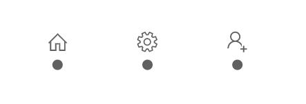
To improve the end user experience, we want to make sure that the colour of the icon for the current screen is one colour, and all other icons are lighter/grey to indicate to our users where they are in the app.
As we have already assigned the colour of the circle to be the same colour as the icon, all we need to do is change the colour property of the icon itself. Click on the icon, navigate to the colour property and use the following snippet:
If(ThisItem.ScreenName = App.ActiveScreen.Name, RGBA(0,98,169,1), RGBA(96,96,96,1))
All of your icons should now be dark gray. We are just one step away now!
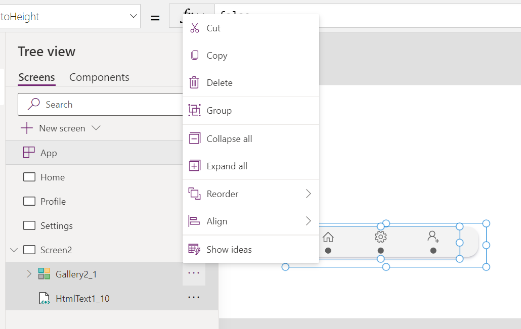
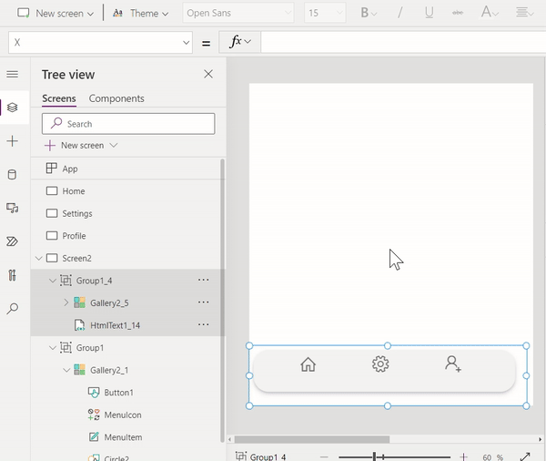
We now need to group the HTML control and the Gallery together (in the later part of this series, we will create an actual component so we won’t need to group these then). Firstly, place the gallery on top of the HTML control.
To group the items, please hold the CTRL button on your keyboard, and then select both the Gallery and HTML control. Right click (or click on the ellipsis) and then select Group.
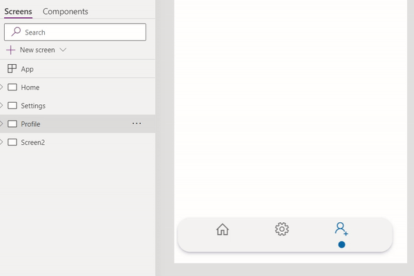
Our menu is ready!! 🤩 All we need to do now is create three sample screens and update the Gallery items. For the purposes of the demo, please create three screens with the following names:
Home
Profile
Settings
We can now update the Gallery items. Navigate to your Gallery, and then the Items property. We will need to replace the App.ActiveScreen with actual screen names - in our case thatS Home, Profile and Settings.
The circles in your menu should all disappear now. All you need to do is copy and paste your menu onto the three screens we’ve added previously and voilla - your menu is COMPLETED!! 🤩
Well done on getting this far!! 🙌 The next blog post will cover replacing icons with SVG’s for much better UI. Please stay tuned for the next blog post which will be going live later this week - don’t forget to subscribe below if you don’t want to miss it!😊